个人 echarts踩坑记录
本文用的比较多的是vchart
由于vchart和echart的配置项大部分一致 比官方稍微多一些的demo样式多一些参考多一些
vchart更新了文档后真的 连个示例图都没 很难受 这是整理的大佬的实例文档
vchart 对比echarts 我觉得好的地方在于数据就是数据 配置就是配置很清楚

需要的数据结构是
chartData: {
          columns: ['日期', '访问用户', '下单用户'],
          rows: [
            { '日期': '2018-05-22', '访问用户': 32371, '下单用户': 19810 },
            { '日期': '2018-05-23', '访问用户': 12328, '下单用户': 4398 },
            { '日期': '2018-05-24', '访问用户': 92381, '下单用户': 52910 }
          ]
        }
      }
echarts设置阴影背景问题
 2. 第一个为开始点 第二个为结束点 如果第二个没有 他会默认从一开始到起始点
🌰: [{xAxis: '12'},{xAxis: ''}] 则是 [{xAxis: '0'},{xAxis: '12'}]
[{
            name: `该时间段内应用清榜`,
            xAxis: cItem[0] === 0 ? min : cItem[0]
            // itemStyle: {
            //   color: 'rgba(17, 17, 17, 0.01)'
            // }
          },
          {
            xAxis: cItem[1] === 0 ? max : cItem[1]
          }
]
设置从线到上或者下的背景
- 设置的代码
origin 是方向 end:为到下面的位置
colorStops 是颜色分布
{
 origin,
 color: {
   type: 'linear',
   x: 0,
   y: 0,
   x2: 0,
   y2: 1,
   colorStops: [
     {
       offset: 0,
       color: seriesAreaColors[colorIndex][0] // 0% 处的颜色
     },
     {
       offset: 1,
       color: seriesAreaColors[colorIndex][1] // 100% 处的颜色
     }
   ]
 }
}
interval ? splitNumber
interval ? splitNumber都是按多少分割 但是
splitNumber 是echarts 按照这个大概的分成这个 不准 不一定一定是分成这个
interval 是按照刻度的间隔 来分
Series设置相关
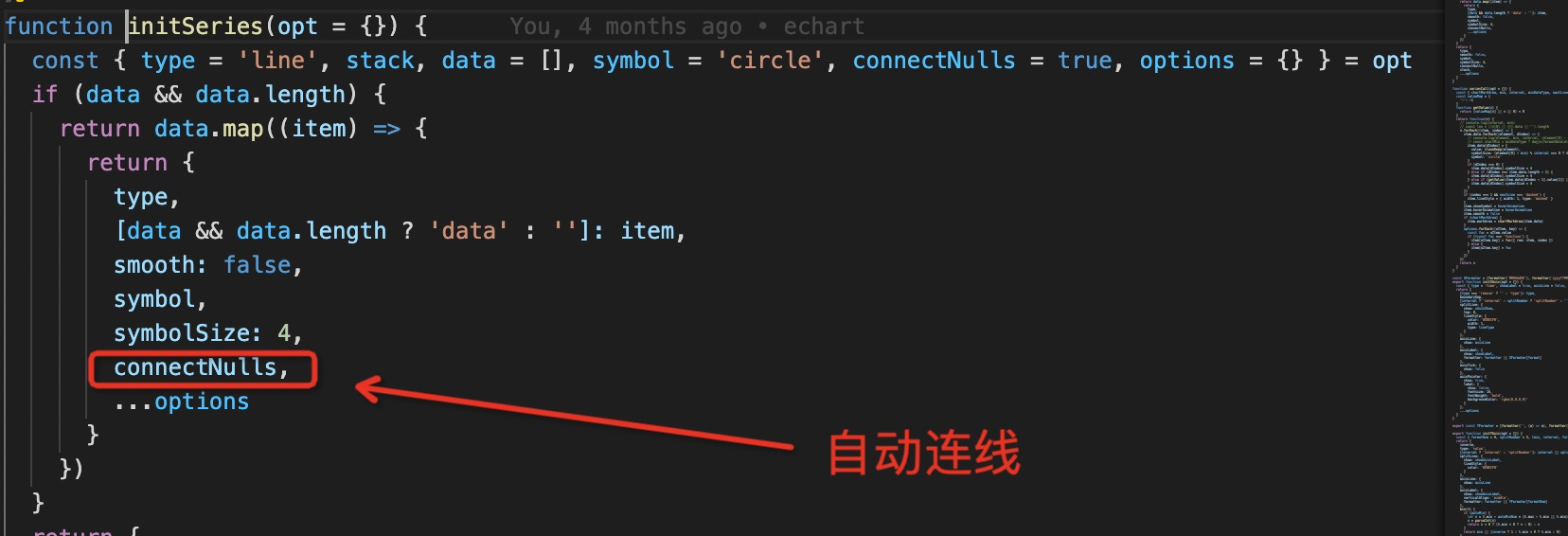
自动连线
设置与x轴相交的点 变大 效果:
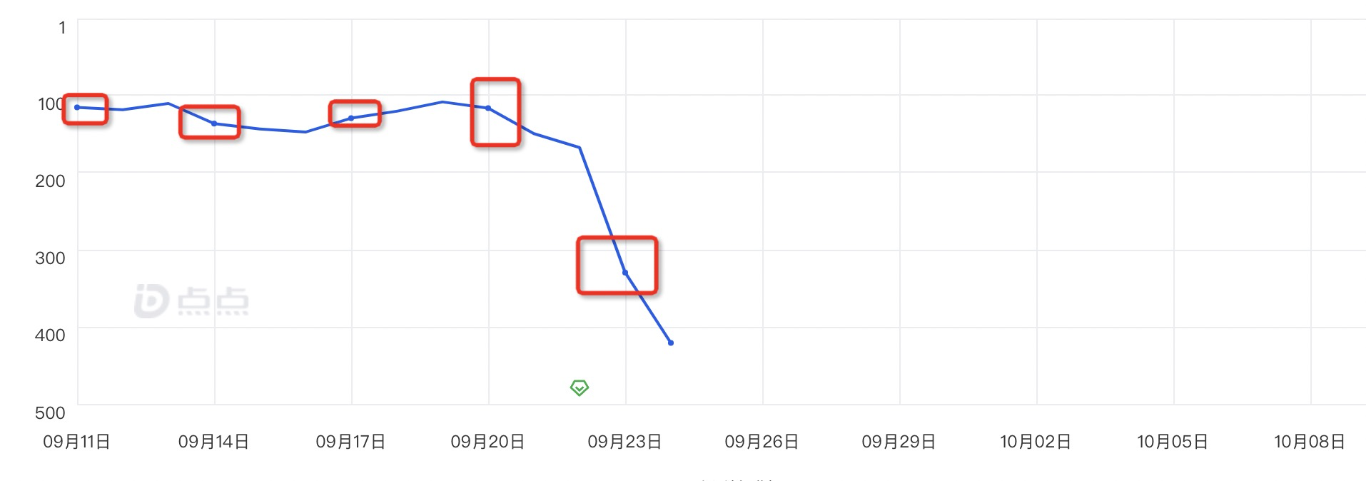
(element[0] - min) % interval === 0 ? 4 : 1, 是 当前的x轴的位置 减去最小的 如果除上 平均的刻度 如果除上了 这是与x轴相交 将他的大小设置成4 不然就是1
showSymbol是否展示点 hoverAnimation是否hover变大
代码
function(v) {
    v.forEach((item, index) => {
      item.data.forEach((element, dIndex) => {
        item.data[dIndex] = {
          value: cloneDeep(element),
          symbolSize: (element[0] - min) % interval === 0 ? 4 : 1,
          symbol: 'circle'
        }
        if (dIndex === 0) {
          item.data[dIndex].symbolSize = 4
        } else if (dIndex === item.data.length - 1) {
          item.data[dIndex].symbolSize = 4
        } else if (getValue(item.data[dIndex - 1].value[1]) || getValue(item.data[dIndex + 1][1])) {
          item.data[dIndex].symbolSize = 4
        }
      })
      item.showSymbol = hoverAnimation
      item.hoverAnimation = hoverAnimation
      item.smooth = false
    })
    return v
  }
grids
设置的是图例
- containLabel 坑:当点特别多的时候 有时候点没办法hover上 点已经在图例的外面 这时候可以设置containLabel 为false grid 区域是否包含坐标轴 这样就能hover上了
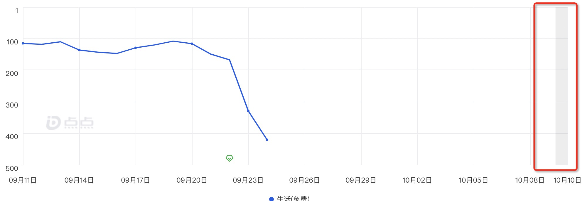
补全时间戳逻辑
有时候后端给到的点可能只有某几个 但是产品需要展示所有的点 这时候需要补全下时间戳 然后给到echart
由于我们公司给到的数据结构是
[
    {
        name: '排名',
        stats: [
            ['时间戳', '数据']
        ]
    }
]
所以逻辑是
(list = [], title = 'name', stats = 'stats', other = '', pre = false) => {
    const times = [] // 存放所有时间戳
    const columns = pre ? [] : ['date']
    const rows = []
    // 初步处理的数据
    const lines = []
    // console.log(list, 'listlist')
    list.map((item) => {
      const lineMap = {} // 构造数据map
      if (item[title]) {
        columns.push(item[title] + '') // 向columns 添加数据
        item[stats].map((cItem) => {
          times.push(cItem[0]) // 把所有时间戳聚合到times中
          lineMap[cItem[0]] = cItem[1]
        })
        lines.push({ lineMap, name: item[title] })
      }
    })
    // 对所有时间戳进行去重
    const tempTime = [...new Set(times)]
    tempTime.forEach((item) => {
      // 遍历时间戳进行取值
      const obj = pre ? {} : { date: parseInt(item + '000') }
      lines.forEach((lItem) => {
        obj[lItem.name] = lItem.lineMap[item] === '' || lItem.lineMap[item] === undefined || lItem.lineMap[item] === null ? '-' : lItem.lineMap[item]
      })
      rows.push(obj)
    })
    rows.sort((a, b) => {
      return a.date - b.date
    })
    return { columns, rows, [other]: list[0] ? list[0][other] : '' }
  })